


::my first try at google sketchup::

::not to shabby ^_^::
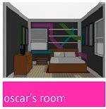
I know, it's basically a giant paint swatch, but seeing it in a large scale kind of makes me say, "oh la la." I wasn't going for a focal point here (like we did with the family room) but rather, more of a backdrop. I think it might work nicely with all white furniture.

Another idea we have is a bit tricky...trickier than anything we've painted before. Our inspiration? A subway transit map. More specifically the NY city subway map from the 70's.

Could it be done? Perhaps. Would it look good? Tough to say. In either case, we'll be buying enough 3M painter's tape to make a whole village of Smurf Mummies.
What are your thoughts? Giant swatch or transit map?
I like both. I like the second one best but that looks like ton of work. Im a sucker though for awesome shades of blue. Whatever you both decide I am sure it will look awesome.
ReplyDeleteIm going to vote for Giant swatch and guess that if Kev does read this he will go for transit map
Oooh... that paint swatch idea is really cool! It would be very interesting to see it translated into real life. I like how you paired it with all white furniture. It kind of has a beachy look to me.
ReplyDeleteAnd if you could pull off the transit map, then more power to you! It gives me a headache just thinking about all that tape! :)
transit map! that would look sooo cool! i may be a bit biased when it comes to public transit, though. ;)
ReplyDeleteI really like the blues better--very chic and yet still rest-provoking. I love all white furniture and accessories could pick up each of the different blue hues. Classy.
ReplyDeleteGreat looks! Why not paint swatch walls with framed maps?
ReplyDeleteGood call Aimee....Transit Map it is. =)
ReplyDeleteOh I love the idea of the transit map!! Its soooo unique, but then again, so is the giant swatch! That's a hard one!
ReplyDeleteI really can't decide!
The paint swatch (although cool) seems too 70's to me. However (and somewhat ironically) the 70's subway thing seems like a better idea.
ReplyDeleteYou can then put "Oscar's Room" in Helvetica on the top.
Better yet, you can just buy the same sepia-toned wallpaper that's inside Subway resturants. :)
Lastly (I'll shut up after this I promise) , I know you want to paint, but you could probably get away with a custom wall paper of an actual blown up map, I've seen it done before with other things. I just don't know how much that would cost though.
The idea Chris has about custom wall paper is REALLY cool. I also love Kasey's suggestion. I think it would be great to somehow combine both thoughts.
ReplyDeleteGreat read thank yoou
ReplyDelete